How to create Bar Charts with CSS flexbox property
A Comprehensive Guide to Designing and Developing Both Horizontal and Column/Vertical Bar Charts Using CSS Flexbox


Table of contents
Introduction
A chart is a piece of information in the form of a table, graph or diagram. They are used to display series of numeric data in a graphical format to make it easier to understand large quantities of data and the relationship between different series of data.
CSS Flex
CSS flexbox is a layout model that allows you to align and distribute space among items in a container. It is a one-dimensional layout concept that allows for fine-tuning specific sections of a web page either as a row or column. In this article, I will show you a step-by-step guide on how to create a bar chart using CSS Flex. Below is a scenario whose data we will visualise using CSS Flexbox.
Scenario
A small business was surveyed to determine the gender of its customer base over one month. The survey collected data over the following parameters: Gender: (male/female)
Result: The survey found that out of 500 total customers, 300 were female, and 200 were male. The percentage breakdown of customers by gender was 60% female, 40% male.
To solve this,
I created a basic Html document, and add give it a title. In this case I will title it "CSS Flex Charts"
<!DOCTYPE html>
<html>
    <head>
        <title>CSS Flex Charts</title>
    </head>
    <body>
    </body>
</html>
I also created a CSS file and named it "styles.css". Then I linked it to my HTML document.
<head>
    <title>CSS Flex Charts</title>
    <link rel ="stylesheet" href="styles.css">
</head>
In my HTML document, I created five div elements, to represent the information provided by the scenario.
<body>
<div class ="horizontal">
<div class="label">Gender</div>
<div class="container">
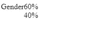
<div class="female">60%</div>
<div class="male">40%</div>
</div>
</div>
</body>

I added an internal CSS to class male and female to set the flex-basis property to their respective percentage values.
<body>
<div class="horizontal">
<div class="label">Gender</div>
<div class="container">
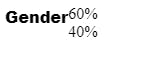
<div class="female" style="flex-basis: 60%;">60%</div>
<div class="male" style="flex-basis: 40%;">40%</div>
</div>
</div>
</body>
flex-basis property sets the initial size of the female and male elements to 60% and 40% respectively of the available space. As you notice there is no noticeable effect yet.
I then defined the styling in the CSS file.
I set the horizontal div display to flex and its items alignment to stretch
.horizontal{
    display: flex;
    align-items: stretch;
}
display: flex: sets the property of the horizontal element to flex which enables flexbox layouts for its child elements.
align-items: stretch: sets the alignment of the horizontal's elements along the cross-axis (perpendicular to the main axis) to stretch, which will cause them to fill the available space in that direction.
Next, I defined the styling for the div with the class label
.horizontal .label{
    flex: 0 0 auto;
    font-family: Arial;
    font-weight: 900;
}
flex: 0 0 auto: sets three flex properties for the label element the values are flex-grow, flex-shrink and flex-basis. Here, flex-grow is set to 0 which means the label will not grow to fill available space. flex-shrink is also set to 0, which means the label element will not shrink when there is no available space. flex-basis is set to auto this will set the initial size of the container to be based on it content.
font-family: is set to Arial and the font-weight to bold in order to increase the contrast of the label element.
Then, I defined the styling for the container elements.
.horizontal .container{
    flex: 1;
    display: flex;
    justify-content: flex-start;
}

flex: 1: This sets, the flex properties of the container.flex-grow is set to 1, which means the container will grow to fill the available space. flex-shrink and flex-basis are not set, so they'll use their default values.
display: flex: sets the property of the container element to flex which enables flexbox layouts for its child elements.
justify-content: flex-start: this will align the container child elements towards the left side of the container.
Next, I set the styling for the female and male elements. In the female and male div elements, I added a general class of "gender". this will allow for ease of styling and reduced codes. you can also use another method of your choice.
.horizontal .gender{
display: flex;
justify-content: center;
align-items: center;
}
display: flex: sets the property of the container element to flex which enables flexbox layouts for its child elements.
justify-content: center: this will align the gender element content towards the center.
align-items: sets the alignment of the horizontal's elements along the cross-axis (perpendicular to the main axis) to center, which will align the contents of the gender element towards the center.
Finally I added a background color to each of the male and female elements.
.male{background-color: #0000ff;}
.female{background-color: #ffc0cb;}
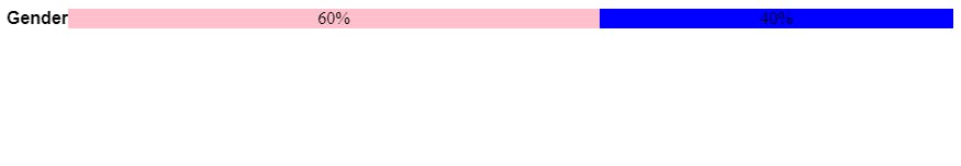
The chart is ready and it is responsive.
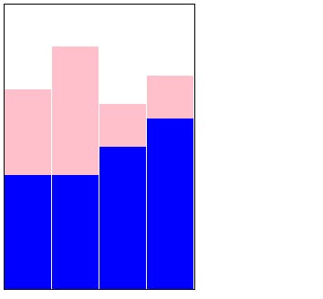
Assuming the survey in the scenario above was carried out for 4 months and the percentage breakdown of customers by gender for the first month was 30% female, 40% male, in the second month, 45% were female and 40% were male, in the third month 15% were females, and 50% were males, while in the fourth month, 15% were females, and 60% were males.
Instead of creating a horizontal bar chart, CSS flex properties allow the creation of a vertical or column bar chart.
First, I created a basic HTML document structure and give it a title.
<!DOCTYPE html>
<html>
    <head>
        <title>CSS flex Charts</title>
    </head>
    <body>
    <body>
</html>
Next, I created a CSS file and link it to my HTML document below the `title` element inside the `head` tag.
<!DOCTYPE html>
<html>
    <head>
        <title>CSS flex Charts</title>
            <link rel="stylesheet" href="styles.css">
    </head>
    <body>
    <body>
</html>
I then created a div and give it a class name, inside the div, I nest four other divs and give them the same class name.
<body>
    <div class="vertical">
        <div class="container"></div>
        <div class="container"></div>
        <div class="container"></div>
        <div class="container"></div>
    </div>
</body>
Inside each of the container div, I nested two other div and gave them two classes each.
<body>
    <div class="vertical">
        <div class="container">
            <div class="bar female"></div>
            <div class="bar male"></div>
        </div>
        <div class="container">
            <div class="bar female"></div>
            <div class="bar male"></div>
        </div>
        <div class="container">
            <div class="bar female"></div>
            <div class="bar male"></div>
        </div>
        <div class="container">
            <div class="bar female"></div>
            <div class="bar male"></div>
        </div>
    </div>
</body>
Then I added a CSS style with the flex-basis property and use the values of the results from each month as values.
<body>
    <div class="vertical">
        <div class="container">
            <div class="bar female" style="flex-basis:30%;"></div>
            <div class="bar male" style="flex-basis: 40%;"></div>
        </div>
        <div class="container">
            <div class="bar female" style="flex-basis:45%;"></div>
            <div class="bar male" style="flex-basis: 40%;"></div>
        </div>
        <div class="container">
            <div class="bar female" style="flex-basis: 15%;"></div>
            <div class="bar male" style="flex-basis: 50%;"></div>
        </div>
        <div class="container">
            <div class="bar female" style="flex-basis: 15%;"></div>
            <div class="bar male" style="flex-basis: 60%;"></div>
        </div>
    </div>
</body>
To visualise my data, I added CSS first to our vertical div element, to set the display property as well as the amount of space I want it to occupy. See the result after the code.
.vertical{
    display: flex;
    height: 450px;
    max-width: 300px;
    align-items: stretch;
    border: 1px solid black;
}

display: flex: sets the property of the horizontal element to flex which enables flexbox layouts for its child elements.
max-width: sets the maximum width of the vertical elements to 300 pixels, this implies that the width will not exceed 300 pixels.
align-items: stretch: sets the alignment of the vertical's elements along the cross-axis (perpendicular to the main axis) to stretch, which will cause them to fill the available space in that direction
border: sets the border-width to 1 pixel, border-style to solid and the border-color to black. Add styling to the container elements
Then I added styling to my container element. This does not produce any noticeable visual effect or changes yet,
.vertical .container{
   flex: 1;
   display: flex;
   flex-direction: column;
   align-items: stretch;
   justify-content: flex-end;
}
flex: 1: This sets, the flex properties of the container. flex-grow is set to 1, which means the container will grow to fill the available space. flex-shrink and flex-basis are not set, so they'll use their default values.
display: flex: sets the property of the container element to flex which enables flexbox layouts for its child elements. flex-direction: column: sets the orientation of the child element to column.
justify-content: flex-end: aligns the child elements towards the base of the flexbox.
Finally, I added a border to the bar element. and a background color to each of the male and female elements and my column chart is ready.
.vertical .bar{border-right: 1px solid white;}
.male{background-color: #0000ff;}
.female{background-color: #ffc0cb;}
border-right: sets the right side border of each of the bar elements. The width is 1 pixel, the border type to solid and the color to white.
background-color: sets the background color of male and female elements.
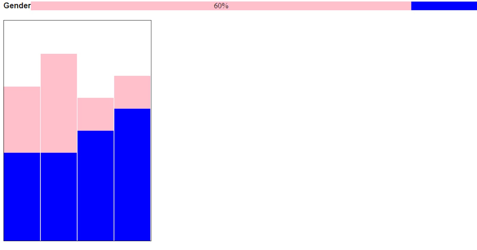
Note that you can have both a horizontal and a column bar chart inside the same web page. This is demonstrated below
HTML
 <!DOCTYPE html>
<html>
    <head>
        <title>CSS Flex Charts</title>
        <link rel="stylesheet" href="styles.css">
    </head>
    <body>
        <div class="horizontal">
            <div class="label">Gender</div>
            <div class="container">
                <div class="gender female" style="flex-basis: 60%">60%</div>
                <div class=" gender male" style="flex-basis: 40%;">40%</div>
            </div>
        </div>
        <div class="vertical">
            <div class="container">
                <div class="bar female" style="flex-basis:30%;"></div>
                <div class="bar male" style="flex-basis: 40%;"></div>
            </div>
            <div class="container">
                <div class="bar female" style="flex-basis:45%;"></div>
                <div class="bar male" style="flex-basis: 40%;"></div>
            </div>
            <div class="container">
                <div class="bar female" style="flex-basis: 15%;"></div>
                <div class="bar male" style="flex-basis: 50%;"></div>
            </div>
            <div class="container">
                <div class="bar female" style="flex-basis: 15%;"></div>
                <div class="bar male" style="flex-basis: 60%;"></div>
            </div>
        </div>
    </body>
</html
CSS
.horizontal{
    display: flex;
    align-items: stretch;
    margin-bottom: 20px;
}
.horizontal .label{
    flex: 0 0 auto;
    font-family: Arial, Helvetica, sans-serif;
    font-weight: bold;
}
.horizontal .container{
    flex: 1;
    display: flex;
    justify-content: flex-start;
}
.horizontal .gender{
    display: flex;
    justify-content: center;
    align-items: center;
}
.male{background-color: #0000ff;}
.female{background-color: #ffc0cb;}
.vertical {
    display: flex;
    height: 450px;
    max-width: 300px;
    align-items: stretch;
    border: 1px solid black;
}
.vertical .container {
    flex: 1;
    display: flex;
    flex-direction: column;
    align-items: stretch;
    justify-content: flex-end;
}
.vertical .bar {border-right: 1px solid white;}
The result is indicated below
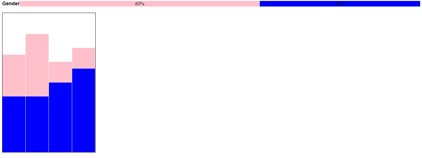
The Chart is responsive. Let me know in the comment section if you find this impactful.
Thanks for reading.